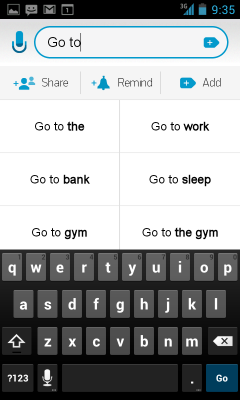
 Any.DO started as an Android-only solution to the public’s to-do list blues, and it did a damn good job of cheering us up. As a result, Any.DO became a both popular and critically acclaimed app by tech blogs everywhere. Personally, I’ve been a regular user of Any.DO for the past six months or so and I appreciate its minimalistic approach to list-making.
The strength of Any.DO lies in its simplicity. Rather than overcomplicating a simple task manager with endless menus and options, the focus is placed on entering tasks under simple headings like Today, Tomorrow, This Week, or Later. The app is definitely gorgeous with bold typography and basic colour schemes, and though the Android version is clean and free of cheesy effects, the iOS app is (nauseatingly) made to look like crumpled paper.
It appears that the designers took some inspiration from Windows Phone, but you won’t hear me complaining about borrowing a few aesthetics from the most beautiful software ever. The app displays black text on a white background by default, but a dark theme allows you to reverse the coloration. Above all, it’s clean.
And if you’re in the market for a new task manager there’s never been a better time to pick up this app, especially now that it syncs across all the major platforms (only Windows Phone 7 is missing). Syncing is automatic once you register with the service or choose to sign up via Facebook.
The iOS App

Additional gesture-based controls have been implemented in the iOS version: drag down from the top of the screen to enter a new task (hold down after dragging to enter an item with your voice) and swipe right to cross out a completed task. Additionally, when entering an item for your list the app attempts to predict what you’re trying to type. It’s moderately useful at times — finishing “Buy” with “milk and bread” saves a bit of time) — and when the app adds a handy phone button beside names that exist in your address book.
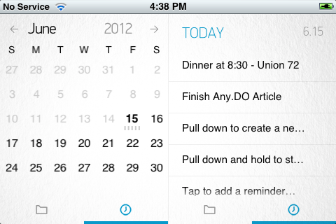
Tapping on a task brings up a menu that allows you to set it to a higher priority, move it to a specific folder, assign a due date or note, or share it with friends. You can also drag items around to reorder and prioritize certain tasks over others, much like in the Android app. The iOS version takes better advantage of screen real estate than its Android counterpart, however, displaying a calendar alongside your task list when the device is in landscape mode. But with luck, this feature will appear on Android soon.
The Chrome App

Of course, given its home on conventional desktops and laptops, the Any.DO Chrome app lacks the gesture-based controls of its mobile brethren. But the aesthetic remains consistent, though you’re unable to change the color scheme from the default white. Check marks are used to indicate completed tasks instead of swiping, but can still be reorganized by clicking and dragging. The app opens from an icon to the right of the address bar and drops down over your current browsing session — no need to open a new tab or window. But the option to pop Any.DO out into its own window is there for those of you who’d prefer.
Conclusion
As a light user of task-based apps, Any.DO is the one and only solution to my needs. The new Chrome and iOS apps mean I can finally sync lists across my Nexus S, iPad, and MacBook Pro (running Mac OSX and Windows 8 Release Preview).
The fact remains, however, that if you’re a heavy user the lists can get a bit cumbersome. Most items end up lumped into the Today category if they don’t have a due date so lists can get out of hand if you don’t pay attention. I still think it’s worth a try for anyone in need of a new task manager since it’s free and using folders may lessen the organizational load. If you do try it out, let us know what you think.
[nggallery id=14]

Leave a Reply
You must be logged in to post a comment.