Windows Phone 7 is the most refreshing take on a smartphone OS to date. I find iOS to be awkwardly simple, with little innovation or interest generated by the operating system itself. Instead, Apple relies on its App Store and solid hardware to keep the customer’s attention. Android has its established fan base that appreciate the many options and customizations available to them, but I can’t stand the user interfaces that come preloaded.
When my iPhone took a nasty tumble the other day, it gave me a perfect excuse to spend some time perusing the Internet for anything and everything Windows Phone 7.
Read on to find out what all the fuss is about!
Windows Phone 7 Basics
The Home Screen
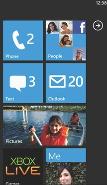
Windows decided on a flat, colorful, graphic interface that really makes it stand out amongst its peers. Instead of taking the TouchWiz route that Samsung went with for their Android Custom UI and copying the already successful design of iOS, they took an entirely different approach.
It is all big, bold squares and white icons with lists and primary colors. No 4×4 layout; the tiles are more varied in sizes with both rectangular and square icons. The home screen can be customized the same as most smartphones, by choosing which apps are available and allowing you to switch around their order at will.
Hubs
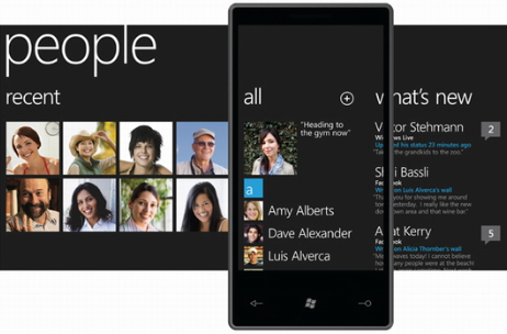
These are apps that actually span multiple screens. This concept is used in the Twitter, Facebook, and Netflix apps. It seems to work well, swiping across the screen to see status updates or Twitter replies. Certainly a lot nicer than opening up separate apps. A great example of just how useful the Hubs can be, is the People Hub.
You can slide left or right across the screen to see different information about your contacts, even showing a collage of profile photos. A swipe to the right brings up a list of all your contacts and clicking on a name not only brings up their phone number, it also brings up the option to write on their Facebook wall. In addition, it will show their current profile photo and status update.
Live Tiles
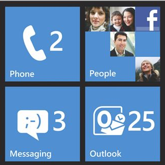
It turns out the simple squares on the home screen are actually not that simple. For instance, the email and phone tiles both show the number of unread emails and missed calls respectively. But of course, that is not all they do.
The subject and time of your most recent upcoming appointment will be featured on the calendar tile and pinning contacts to your home screen will display their profile photo, as well as their latest status updates.
Notifications
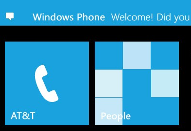
The consensus on Windows Phone 7’s notification system is that it is better than iOS (not hard to achieve), but still not quite as good as Android’s system tray. They are known as “toast” notifications, sliding down from the top of the screen when you receive a new message, or email, etc. Battery life and Wi-Fi information are handled in the same way, visible after sliding down from the top of the screen.
Office Integration

Here is where Windows Phone 7 really shines. After all, who does Office better than Microsoft? No one. It’s called Microsoft Office!
Oh, if only that were true! It’s not. The Office integration leaves a lot to be desired. They seem to have put the focus on collaboration rather than creation.
Word has quite a few missing features that you’d think to be easy to implement, like the inability to change fonts or the choice of only four text colors: orange, green, red, and black. At least they can display the documents well enough.
Excel seems to fare better with many of its features successfully making the transition to the small screen. But who is going to use Excel on their mobile?
PowerPoint is more of the same. It allows you to playback already finished slideshows, but if you are hoping to do any editing or creation, then you are out of luck. But I guess it is better than nothing.
Apps
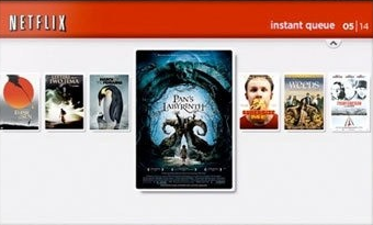
Surprisingly, the Windows Phone 7 market is faring quite well in terms of the Apps available and its overall quality. The obvious ones are there, like eBay, Netflix, Flixster, and Pandora as well as Facebook and Twitter. Angry Birds, however, isn’t due until May 25! *gasp*
In the meantime, might I suggest “Bye Bye Brain”?
Devices
Samsung Focus
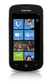
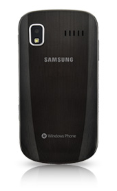
Stop right there. The Samsung Focus is the “Be All, End All” of Windows Phone 7 devices. It is the thinnest of all the devices on offer and has the best screen thanks to Samsung’s Super AMOLED technologies. However, if you are on the other side of that big body of water (read: Ocean) you will be equally happy with the Dell Venue Pro or the Samsung Omnia 7. Or if you are a Sprint subscriber, the HTC Arrive will be your first choice!

Leave a Reply
You must be logged in to post a comment.