Dear people living under rocks this past week: If you haven’t noticed, Google has decided to tackle bold new things recently, with widespread success. First, they came out with Google+, a type of digital, communal gathering site that allows one to keep up with friends and collaborate with them (Which I am sure that Techerator will summarize into article form). And that was pretty cool.
But then, they did something even cooler and bolder than diving into the social networking realm: they updated Gmail with new themes and revamped Google Calendar! Isn’t that amazing! These new changes are a direct result of the Google+ launch in order to make Google’s products look more streamlined and uniform, as well as continuing the progress towards cleaner aesthetics.
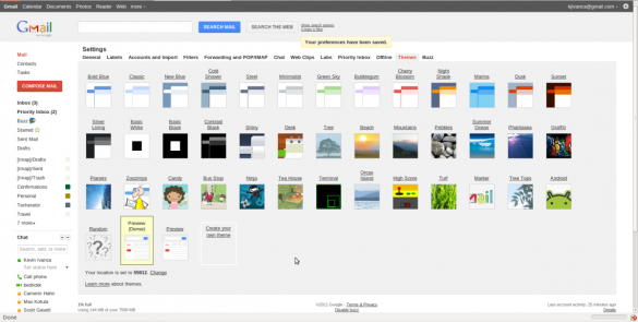
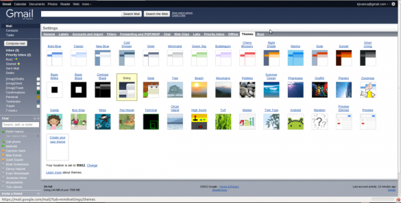
The new look for Google Calendar will be turned on automatically, but you’ll have to activate the new Gmail themes yourself through the use of special new “Preview” themes. Gmail themes can be found by clicking the settings icon in the top right corner of your Gmail account (by your email name), selecting “Mail Settings”, and then going to the “Themes” tab. You can then select either “Preview” or “Preview (Dense)”, the latter having less padding between each item in your inbox.
And for those of you still living under rocks without a Google account, here’s a few pictures to show off the neatness.
Before:
Old Gmail
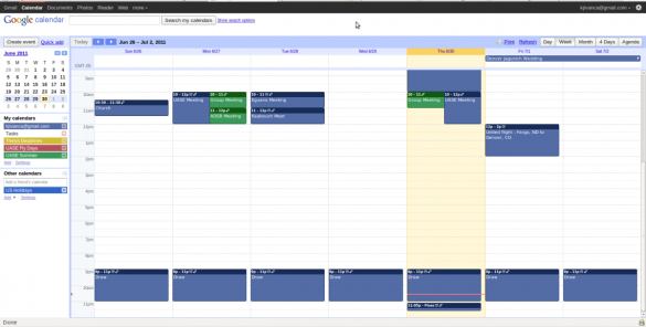
Old Google Calendar

After:
New Gmail

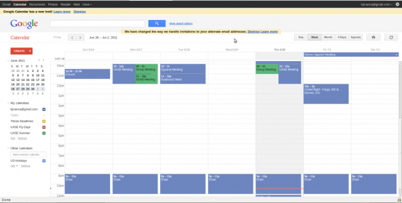
New Google Calendar

I’d say that Google cleans up quite nicely for its couple hundred million users. And that’s something you can truly leave the rock behind for.


Leave a Reply
You must be logged in to post a comment.