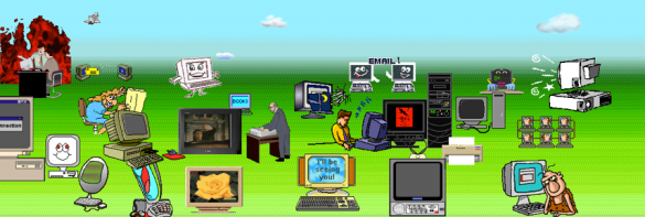
 All too often we see websites that are difficult to navigate, read, or simply don’t make sense. In the process of looking for a trendy new look, site owners created a cluttered monster instead. There may be sliders, large photos that take too long to load, or design features that tend to muddle each page. Sure there’s the outdated site or two that’s just behind the times, but that doesn’t make their faux pas any less offensive.
As web travelers, we need user-friendly sites, links that take us to the pages they say they will, and plug-ins that don’t overlap. As for ill-designed sites, let’s hope their webmasters get a raise soon.
The Regular Offenders
Other forms of website clutter is found by way of multiple pictures, text that goes on for days, or a buggy template that doesn’t display like it should. These rookie mistakes can lead to loss of business, web traffic, or even some badmouthing on the internet. After all, how can we expect users to successfully navigate pages when the design inhibits them from doing so?
A properly functioning website should:
- bring in new business
- create traffic through word of mouth
- act as a source of marketing for the company
- inform customers
- portray the business in a good light
A cluttered one, however, does just the opposite. Without a design that promotes company navigation, users are more likely to become frustrated or give their business to a competitor. Run-on text can also overwhelm viewers rather than inform and educate them. With an ill-planned design, it’s likely more customers are being sent away than are signing up to hear more.
These errors also hit websites where they hurt most, sometimes even questioning their services. For instance, when marketing companies or tech-savvy sites have cluttered sites, how are customers to trust whether or not they can perform their duties? If it can’t be done at home, customers may wonder whether or not it can be done at all.
De-Cluttering the Web
Despite the many negative effects that can come from a cluttered website, it’s also just plain unappealing. No one wants to search through links and pages when there are plenty of sites that have done the work for them. To save face, bring in business, and to make the Internet a better place, remember to cut the clutter. Your viewers will thank you.


Leave a Reply
You must be logged in to post a comment.