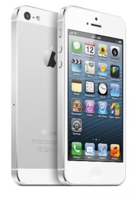
iOS 6, the most recent incarnation of Apple’s mobile operating system, was met with mixed reviews on release.
Some people lamented the fact that it seemed like a rather insignificant change, hoping for a major design overhaul to something that has looked and felt very unchanged for quite some time.
Others criticized specific features, with Apple’s new Maps app first in line for a hammering. The first iteration of Apple’s replacement for the Google’s Maps app was lambasted widely enough for reports to make the headlines of some national newspapers.
I installed iOS 6 immediately after release, and have now been using it for long enough to give my own assessment of the good and the bad. Here’s what I think:
The Good
Maps
I’ll begin controversially: Apple Maps really isn’t that bad. In fact, where I live (in Southern Portugal) the mapping is more accurate and up to date than it was from Google. Our apartment (and car) is actually visible from the satellite imagery, where Google displayed a building site dating back several years.
The turn-by-turn navigation works well too, and everyone has the option to use Google Maps and the multitude of other available mapping apps to fill in the gaps. I think people should give Apple a chance – we are, after all, talking about “version 1.”
Facebook Integration
Facebook integration was long overdue to iOS. Now it’s here, and it works well. It does a good job of explaining the implications of synchronizing contacts and works competently with Siri.
Safari
The iOS browser has always been great, and the subtle tweaks here make it even better. Full screen view makes a surprisingly significant difference to readability, and the reading list functionality is great – even though most enthusiasts probably already use something like Instapaper to save content for offline reading.
The ability to share tabs with Safari on a Mac via iCloud is a good idea too – but not good enough to tempt me away from using Chrome on my laptop.

The Bad
The App Store
I can honestly say Apple have lost revenue from me as a result of redesigning the App store. The new layout might work on an iPad but it looks cut off and a little silly on my iPhone 4S. It’s simply less fun to browse, and as a result, I buy fewer apps. Surely this wasn’t the intention?
Data Usage
I don’t know exactly why, but I used to crawl very slowly through my monthly 500MB cellular data allowance. Since iOS 6, I’m eating through it rapidly and keep incurring extra charges.
Judging by the Web forums this is a rather common occurrence. It needs sorting out.
Design Inconsistencies
I understand that Apple may have given the phone keypad and music browsing interface a white background so that things look newer, but why do these design changes not carry through once you actually select a song? The changes just don’t reflect Apple’s usual impression of quality – and seem to simply be a last-minute way to make iOS 6 look a bit different to its predecessor.
Conclusion
Overall, then, iOS 6 has proved to be inoffensive (other than the data charges) but also rather inconsequential. Though I see no reason for iOS 7 to be different for the sake of being different, I wouldn’t mind something a little more exciting.

Leave a Reply
You must be logged in to post a comment.