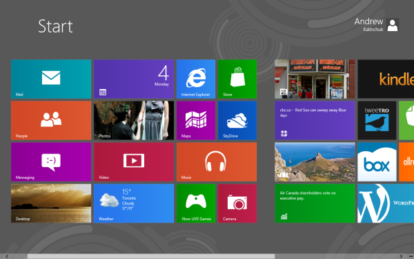
As we assumed when various apps in the Windows 8 Consumer Preview were marked with an “App Preview” tag, the core Metro apps have been updated in the Windows 8 Release Preview. The updated applications feature some improvements to the user interface (there were some apps that really needed it), a unified app settings bar, and even some all-new applications.
The preview pages of some revised apps have been floating around online via the Windows Store, but this is the first time we are seeing the new apps in action. Though it isn’t surprising that the core apps have been updated, we are still extremely excited to see the makeover results. Some of the apps were just plain difficult to use and lacked cohesion, ease-of-use, or basic functions.
To kick things off, we begin by applauding the unified look of the app bar that drops down from the top of the screen. The options may be app-specific, but it’s nice to see a cohesive design structure being employed.
Updated Apps
Photos
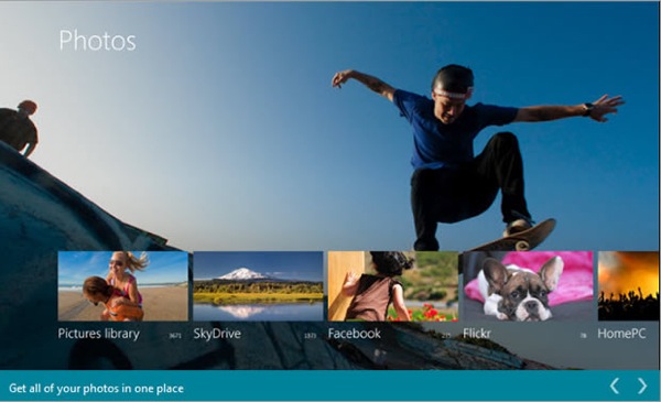
The new Photos app (pictured above) features a new smart screen complete with a full-size background photo chosen from your own collection, and smaller thumbnails pulled from your local library, SkyDrive, Facebook, and Flickr are displayed overtop. It’s very easy on the eyes and closely resembles the Windows Phone version.
Calendar
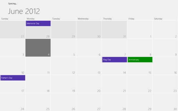
In the Consumer Preview, the Calendar app was missing a simple search function. Maybe not a problem for the average user with two or three appointments in a week, but incredibly troublesome for the power user with a growing number of time commitments. Thankfully that search function has been implemented in the latest release and answered our dearest prayers.
Music
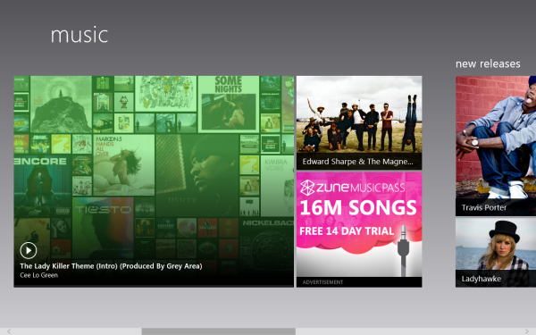
The most exciting change in the Music app is the integration of Zune Pass, which means all of your cloud-based music is finally accessible via the Windows 8 desktop.
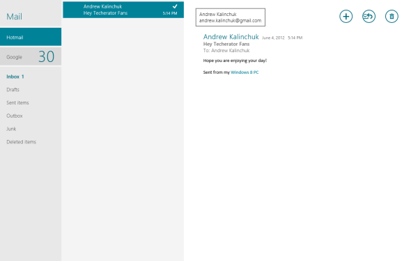
When we first started working with Windows 8, the Mail app haunted our nightmares. It was unreliable and clumsy at best, and though the new version still lacks threaded conversations (really!?), it’s been optimized and crashes a lot less often. The user experience has become actually, well, usable now.
Inboxes are listed on the left-hand pane, doing away with the hellish way of switching inboxes in the App Preview, which involved pressing the back button a whole lot of times. You can also pin specific accounts to your start screen in order to choose whether to check your personal or work email before launching the app. It’s still not as feature-packed as say Gmail or Hotmail, but we must admit that it’s gorgeous.
Web Browsing
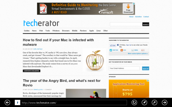
The most interesting and innovative change to IE this time around comes in the form of “Flip ahead”, a feature that uses crowd-sourcing to predict which web page a user will click on next. So instead of needing to click on the suggested page, you can simply swipe or click the on-screen forward button to navigate there. At the moment it works best for flipping to the second page of an article, but hopefully with time the algorithm will prove more useful. “Flip ahead” will be turned off by default, so you’ll have to enable it manually.
Sharing options are built-in now, which isn’t too exciting, but worth noting. Flash has been enabled as well, which was inevitable. But what rocks about Metro IE’s implementation is that it’s plug-in free by default so Flash works without any additional setup.
Weather and Maps
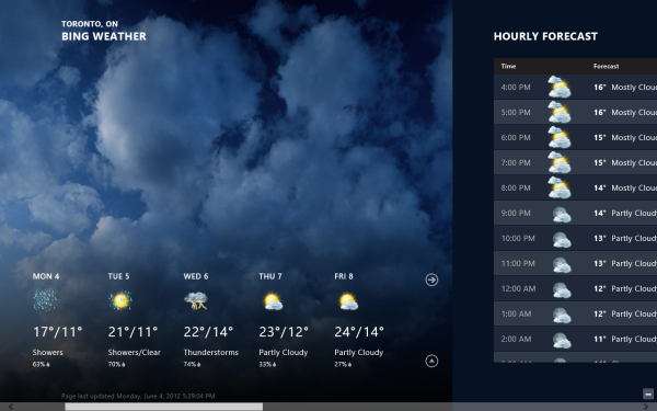
Nothing much has changed here. The Weather app is still beautiful and information-packed. We thought Maps lost it’s dedicated search function, but it was only moved into the Charms bar.
Lock Screen
The lock-screen saw a mini-refresh as well. You can now adjust the volume and pause or skip tracks without unlocking your device, which we love.
Brand New Apps
Most of the new apps are Bing-centric, which makes sense for Microsoft’s clear dedication to all things Bing. The moniker of Bing seems a bit redundant since the apps are obviously powered by the search engine, but you can’t blame a company for tooting its own horn. Besides, each app is gorgeous, works great, and beats the pants off the competition.
Bing News
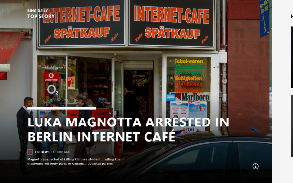
The Bing News app opens up to the top story of the moment and as you scroll right, you’ll find more top headlines pulled from several different categories. The app bar serves as a way to drill down into specific sources or trends. Of course, you can pin any category or custom topic to your start page for quick access to personalized news feeds.
Bing Travel

Basically a Metro version of the site’s trip planning feature, Bing Travel lets you do research and flight / hotel booking. If you don’t already have a destination in mind, the home page serves to inspire you by displaying a collection of pictures and travel articles from featured destinations. Once you choose a place to visit, the app provides you with plenty of helpful details ranging from maps to weather stats and local prices.
Bing Sports

As you may have guessed, Bing Sports helps you keep track of your favorite sports teams and general news stories in the realm of athletics. A top story is displayed on the home page by default and as you swipe to the right you’ll be greeted by more articles, game schedules, and a place just for you called “Favorite teams.” This section of the app is pretty self-explanatory, type in a team name and you’ll receive personalized information relevant to that team like standings, rosters, player stats, etc. And from the app bar up top, you can filter news stories by sport if you could care less about specific teams.
Conclusion
What do you think? Will Windows 8 be the next big thing or the next big flop? Sound off below!
If you’d like a more in-depth look at the Release Preview, a slideshow of all the apps (new & improved) has been provided for your viewing pleasure.
[nggallery id=13]

Leave a Reply
You must be logged in to post a comment.