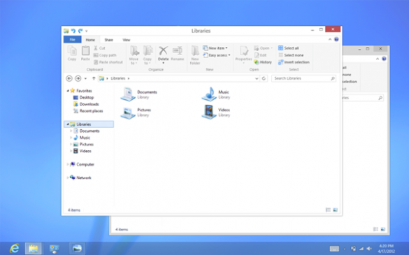
When I first booted up into Windows 8 with my beloved Samsung Focus mobile phone at my side, I was appalled by the jarring visual differences when switching back and forth from the Metro start screen to the traditional Windows desktop view.
On one hand, there was this amazingly simple Start screen with a bold interface daring to standout from the crowd. On the other, an ancient and tacky faux-glass-themed, cluttered, and – quite frankly – ugly desktop interface.
I found it incredible that after putting so much thought into the Metro UI’s design, Microsoft seemed to forget about the desktop altogether. I thought they changed. I thought they cared about details, the user experience, and beauty! My disenchantment became so bad that up until a week ago I had given up on ever experiencing a truly simple and beautifully designed version of Windows.
What changed? Microsoft is getting rid of Aero Glass in Windows 8, baby!
First introduced with the debut of the ill-fated Vista, the Aero desktop design has outlived its relevancy. The days of transparency, gradients, and shadows are long behind us and especially do not belong in a modern interface like Metro that relies on flat icons and bold colors to garner attention. According to Microsoft, they also see the drawbacks of their current design and promise to start “flattening surfaces, removing reflections, and scaling back distracting gradients.”
Microsoft doesn’t see the desktop as a mode, but rather “a paradigm for working that suits some people and specific apps.” But Microsoft isn’t willing to forfeit compatibility with existing programs by drastically changing the desktop UI. To preserve their existing user base, Windows 8 will continue to use black text on a light-colored background as opposed to the white-on-saturated-color look of Metro.
In short, Microsoft gave their desktop UI a mini Metro makeover. The default color that surrounds the windows is white, rounded corners on icons and windows are now squared, and the taskbar blends even more into the desktop wallpaper. Even the ribbon will see some changes with icons treated to the same squared-off edges and stripped of all gradients to “make them feel more modern and neutral.”
Unfortunately, the Release Preview hasn’t fully abandoned the Aero theme and it won’t be fully replaced until the final release of Windows 8. We would have liked to see what it looked like in action, but it just wasn’t in the cards.
If you’ve ever wanted to read a comprehensive history of Windows design over the years, then hit up this post from the Building Windows 8 blog.


Leave a Reply
You must be logged in to post a comment.