Now that the iPhone 4S and iOS 5 have had their chance to bathe in the limelight, the focus can turn to Google’s latest Android release: Ice Cream Sandwich (ICS).
A quick assessment would hail ICS as the answer to Android’s nagging issue of fragmentation. With different versions of the OS scattered all over their various devices, developing for the platform has been notoriously difficult. This is especially problematic when you factor in the fact that Android tablets all run Honeycomb, which was never made to run on a smartphone and requires completely different apps.
Google plans to repair their broken platform by introducing ICS, a version of Android that can run on smartphones and tablets. This means that developers who have typically stuck with iOS because of its universal nature that allows for a single app to be developed for both the iPad and iPhone will finally see Android as a similar opportunity to bring in revenue.
Of course, ICS will affect end-users as well by providing a unified Android experience and therefore more apps. Plus, it’s got some exciting, new features that are definitely worth talking about.
httpvh://youtu.be/-F_ke3rxopc
A Brand New Look
 Colors have changed, with a bright blue replacing the iconic green that has been a part of Android since the beginning. A new font called Roboto has also been added, which is a clean and easy-to-read font designed for pixel dense screens.
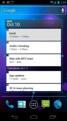
Widgets are now resizable and able to grow larger or smaller in order to make room on your home screen and displaying more or less information based on your preference.
Ice Cream Sandwich moves differently too, with the app drawer scrolling horizontally rather than vertically. Speaking of apps, you now have four customizable spots to place shortcuts on your home screen. Hardware buttons are out – they have been replaced with software buttons for Back, Home, and Recent Apps (which will help make multitasking more useful and accessible).
New Applications and Capabilities
 You can now take screenshots within Android and it is awesome.
Android users will also be treated to a web experience that closely matches that of their desktop with bookmarks syncing automatically with Chrome. For the first time, users can choose to view desktop versions of websites rather than mobile versions. I’m unsure how well they will run, but it’s always preferred to have the choice. And we’ve got offline reading a la Instapaper, which allows you to save longer articles when you are online so that you can read them when you’re without a connection.
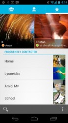
Borrowing ideas from Windows Phone 7, Android phones now feature a People app that includes a larger profile photo, as well as phone numbers, email addresses and social media integration to display status updates. There are also controls for choosing which contacts to display in regards to social networking, as we all know that your entire Facebook friend list is not welcome on your smartphone. Additionally, no matter where you are in the phone, a quick tap on a profile photo brings up quick access to phone numbers, text messaging and more.
The Calendar app has undergone a mini-makeover and now features a unified mode that can display events and tasks from different sources all in one place (at the user’s discretion). It also features color-coded calendars (personal, work, school) and limited gesture-based functionality.
The built-in camera wasn’t left off the list either. It offers tap-to-focus (tap anywhere on the screen to focus the image at that distance), improved facial recognition (locates faces and auto-focuses), and zero shutter lag. It’s got a panoramic mode that assembles a long-range of continuous imagery into a single photo. And the Gallery app has some added (and much appreciated) photo editing tools.
Improved Multitasking, Lockscreen, and Notifications
 On the subject of multitasking, a press of the Recent Apps button brings up a list of thumbnails representing each app you have open and allowing you switch between them smoothly. Side-swiping any app will close it.
Notifications have undergone an overhaul as well. You are now able to swipe individual notifications off of the menu, which vastly improves on the “Clear All” button that is currently used. And to top it all off, all of the notification actions are available on the lockscreen.
Oh, and you may have heard about this already, but your phone is now unlockable using your no doubt adorable mug. Just look into the front-facing camera on your smartphone and access is granted. Unfortunately, this feature didn’t get a great demo as it failed to work during the presentation. I hope that they iron out the wrinkles before release day. And as an added bonus, they’ve finally integrated camera access from the lockscreen without the need for an app.
Gives Control to the User
 After users expressed nothing but frustration since the beginning of smartphones, Android is the first to allow you to uninstall the apps that ship with your phone (crappy bloatware has not been confirmed). But what this means is that if you prefer the Dolphin browser to Android’s stock browser, you can now choose to delete the latter and keep only the former. Not only does it clean up your app screen, it also puts control over your device’s resources back in your hands.
Data usage is now trackable. In the Settings apps, you can now view colorful and detailed charts of your data usage for that month both for data usage, as well as Wi-Fi. Furthermore, you can set alarms to warn you before you go over your limit.
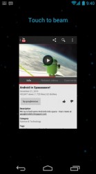
Android Beam is new as well, which is a stock version of the information-sharing app, Bump. If you and a friend both have NFC-enabled phones, you can tap your phones together and share almost anything. This can be music, apps, contacts, videos, etc. It’s cooler than you think. Now your information lies squarely in your hands.
Google offers an even more in-depth look at all the features over at the developer blog.

Leave a Reply
You must be logged in to post a comment.